Components editor
The component editor offers the possibility to create your own placeable components in addition to the standard components in order to insert and fill them in the Page Editor.
Create component
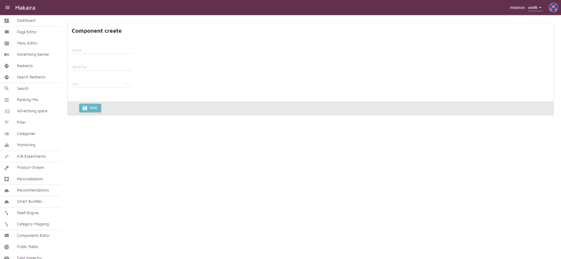
- Name: Name of the components in Makaira
- Identifier
- Icon
Edit components fields
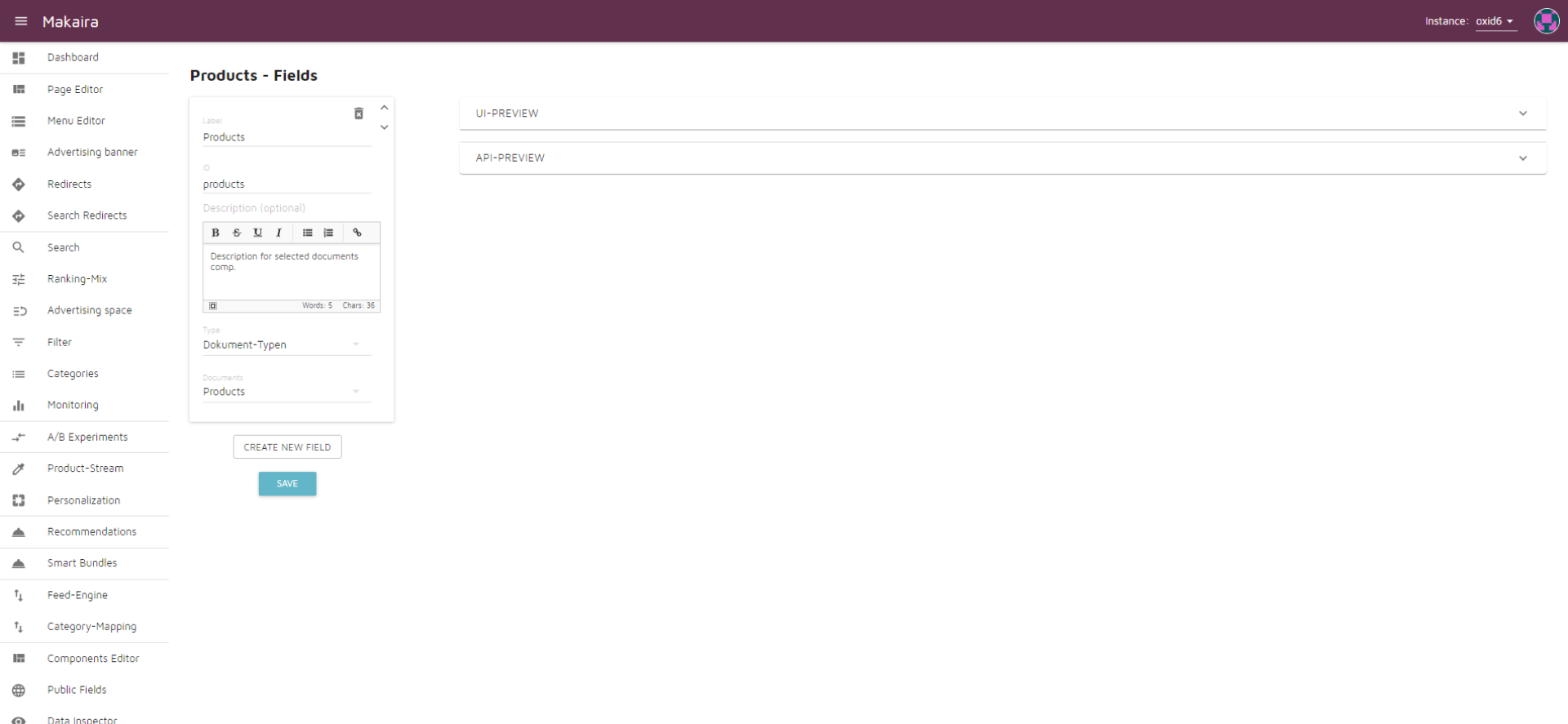
- UI Preview - Provides a preview of how the created component will look in the Page Editor.
- API Preview - Provides a preview of the API
- Creating the fields
- Label - name of the field in Makaira
- ID - name of the field in the API
- Type - function of the field:
Text
The Text type offers the possibility to add a text input
Rich Text
The Rich Text type offers the possibility to add a text input with text emphasis
Number
Number allows to add a number input
File-Upload
The File Upload type enables data upload to Amazon S3 or Cloudinary
Checkbox
The Checkbox type adds a field that can be set to true or false
Select
The Select type offers the possibility of selecting from several options that can be added and deleted as needed using the "New option" button.
Multi-Select
Like the Select type, the Multi-Select type offers the possibility of a selection. The difference is that several options can be selected at the same time.
Object
Via objects a field can be composed of several other fields.
Array
An array field allows you to enter multiple elements of the same type:
- Text
- Numbers
- File-Upload
- Object
Document types
The Document types type is used to add:
- Products
- Searchable Links
- Landing Pages
- Categories
- Manufacturer
Product-Stream
This type allows adding the items of a Product-Streams.
Color Picker
A color picker allows for color selection.
Hotspot Image
A Hotspot Image offers the possibility to set points on a self-selected image and to link them with other fields. Any fields can be added via the "New Property" button.
Updated 9 months ago