Detail editor
The detail editor allows you to place components on your page and fill them with content, configure the general settings like URL, title, the status of the page, and see in a preview how the page will look in your storefront.
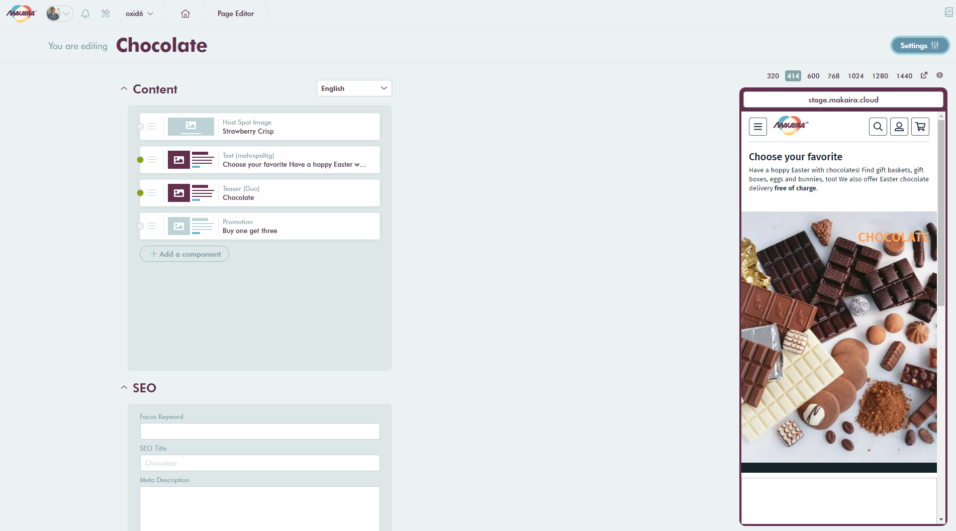
Detail editor with some components
#Settings
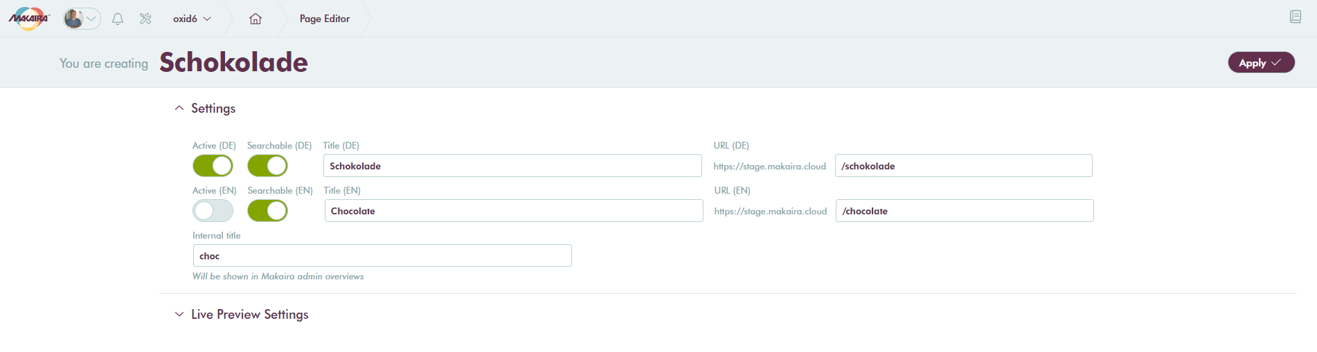
Settings for content type landing page
In the settings, you can control the basic information and several states for the content type. The input fields may vary depending on the content type.
- Active controls if a page is displayed
- Searchable controls if a page can be found by a search request
- Title defines the default title
- URL defines the callable URL
- Internal title allows you to use your own keywords to find pages, categories and more
If you want to use the Live Preview with your storefront please ensure that you set the correct preview endpoint.
After you entered your values you can apply the changes and the detail editor will be shown again.
#Content editing
On new pages you start with an empty content slot whereas for categories you will find a default product grid.
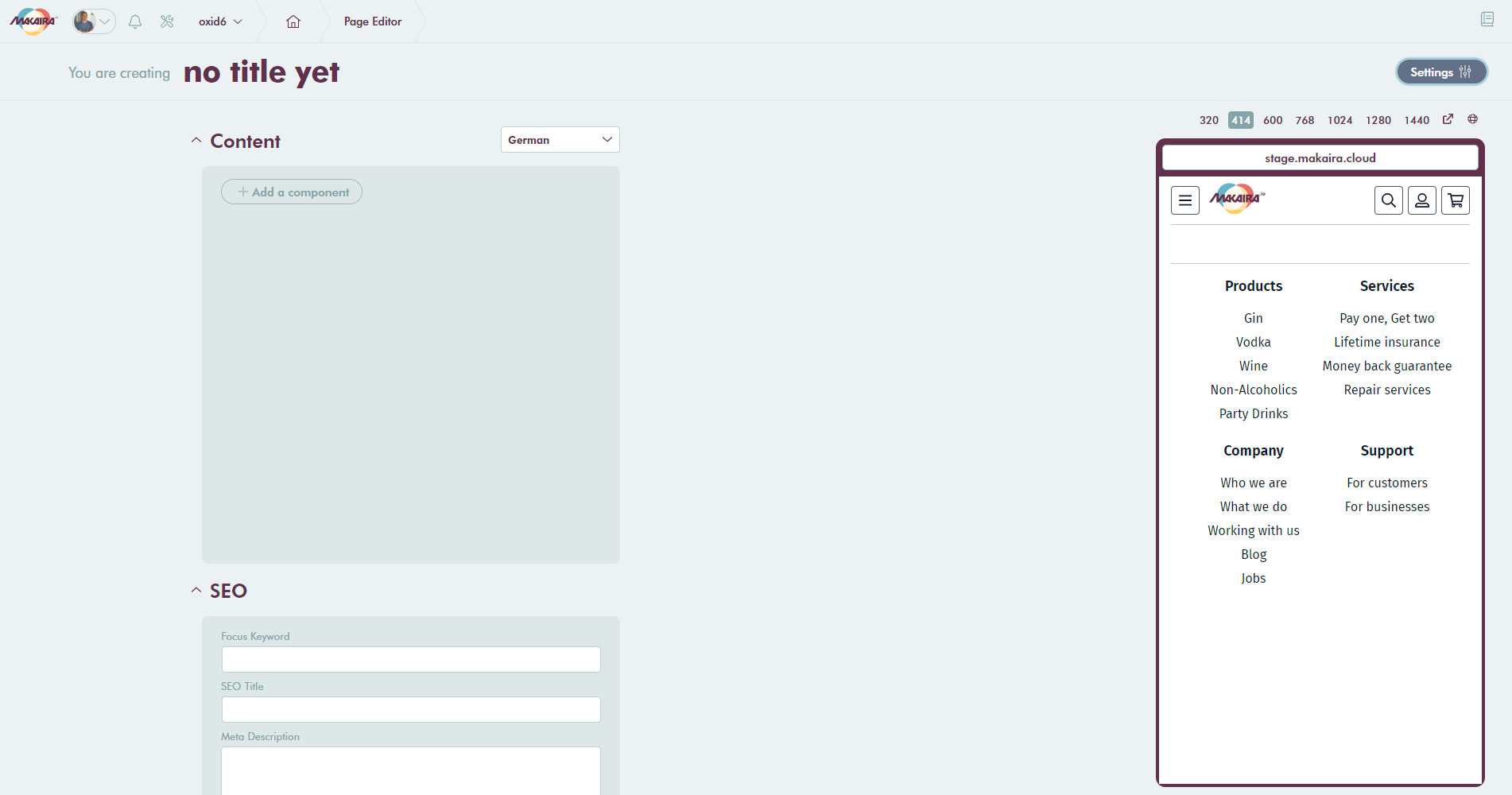
Detail editor
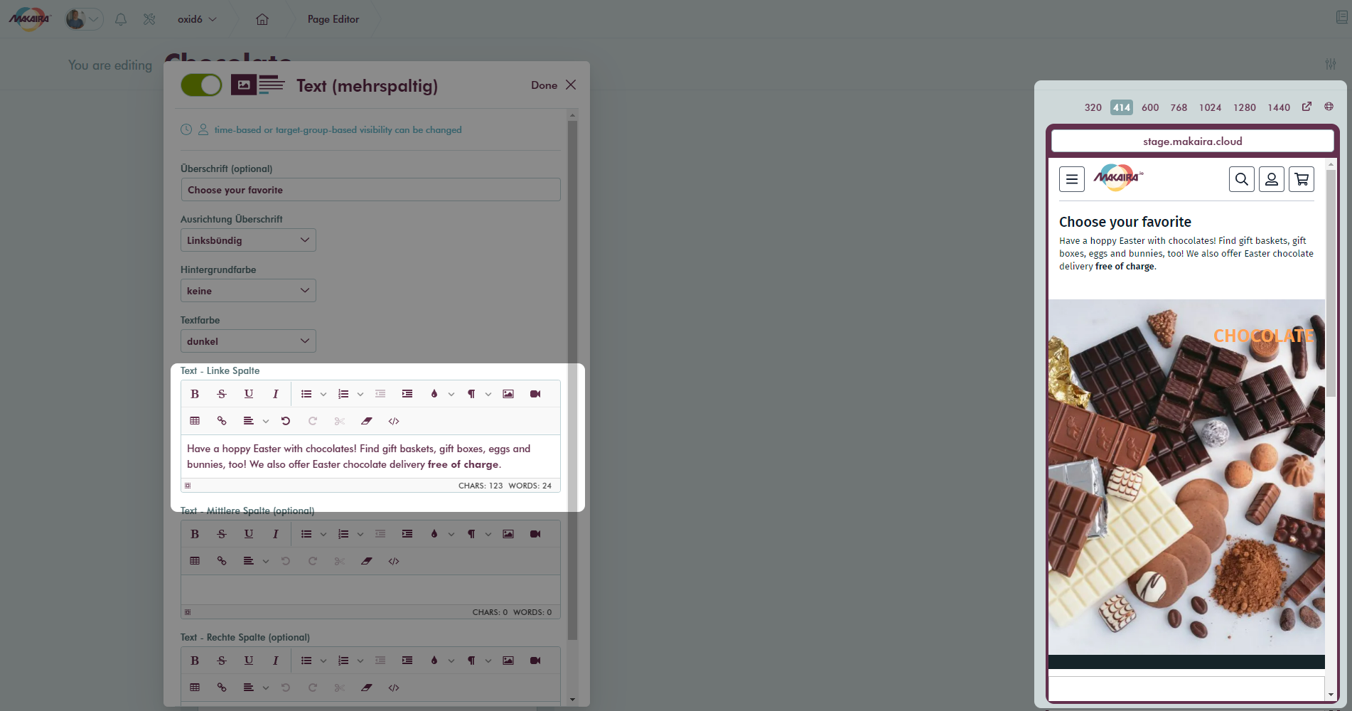
The first step would be to Add a component from the available component list. Each component comes with a defined set of content components like inputs, images, text fields. The amount of items you will see depends on the defined components.
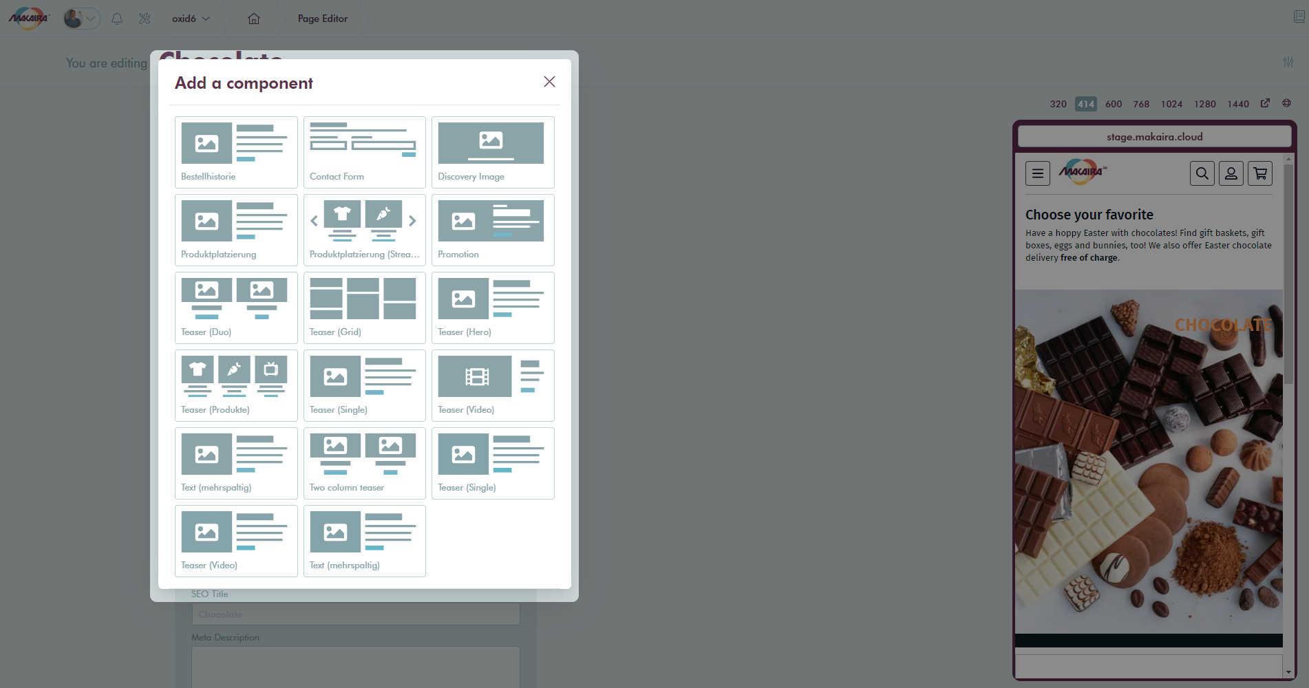
Component list
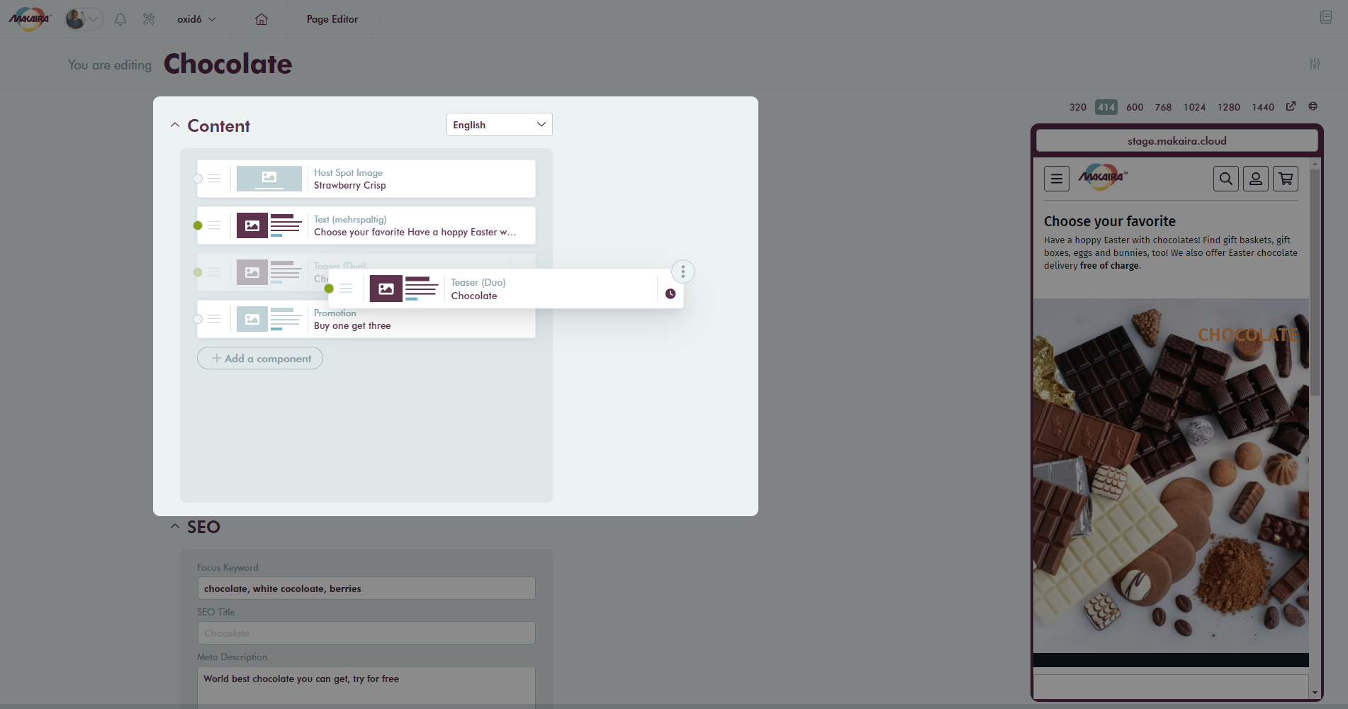
For demonstration purposes we have chosen the Teaser (Duo) component which allows defining images, titles, and targets.
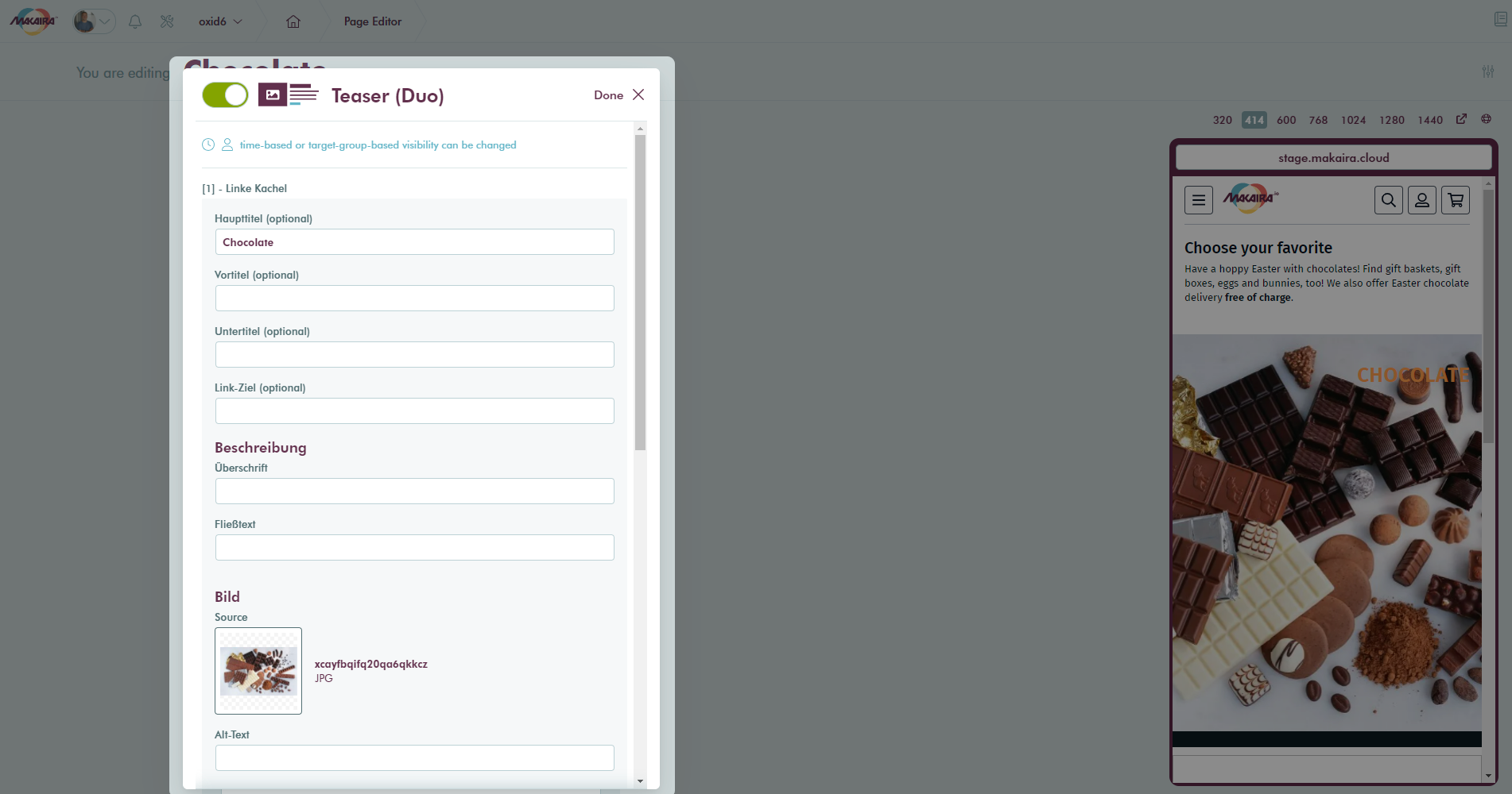
Component: Teaser (Duo)
At the top of the component you can control the activity for the component in the corresponding language and close the dialog. All changes will be kept till you save or discard them.
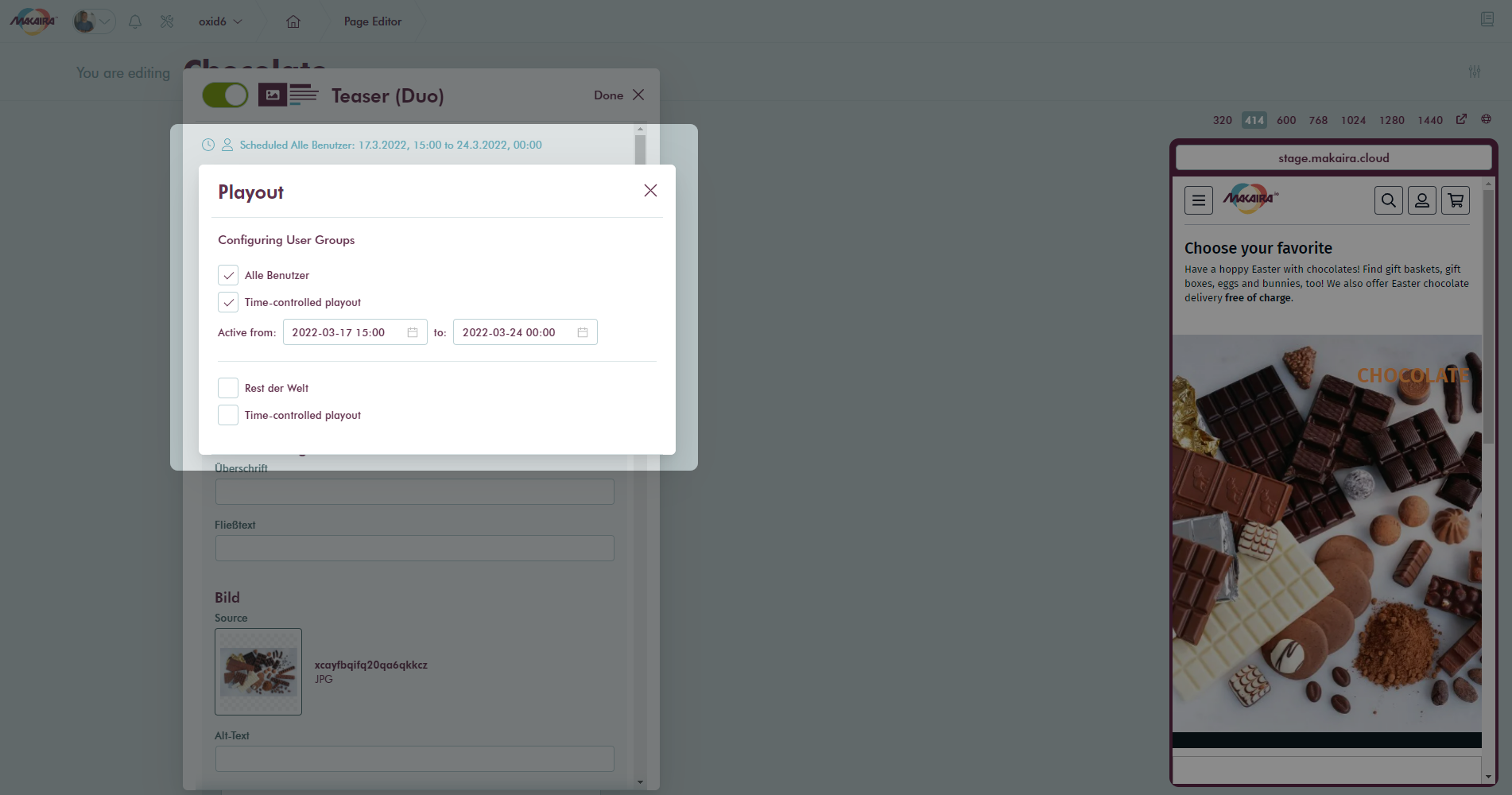
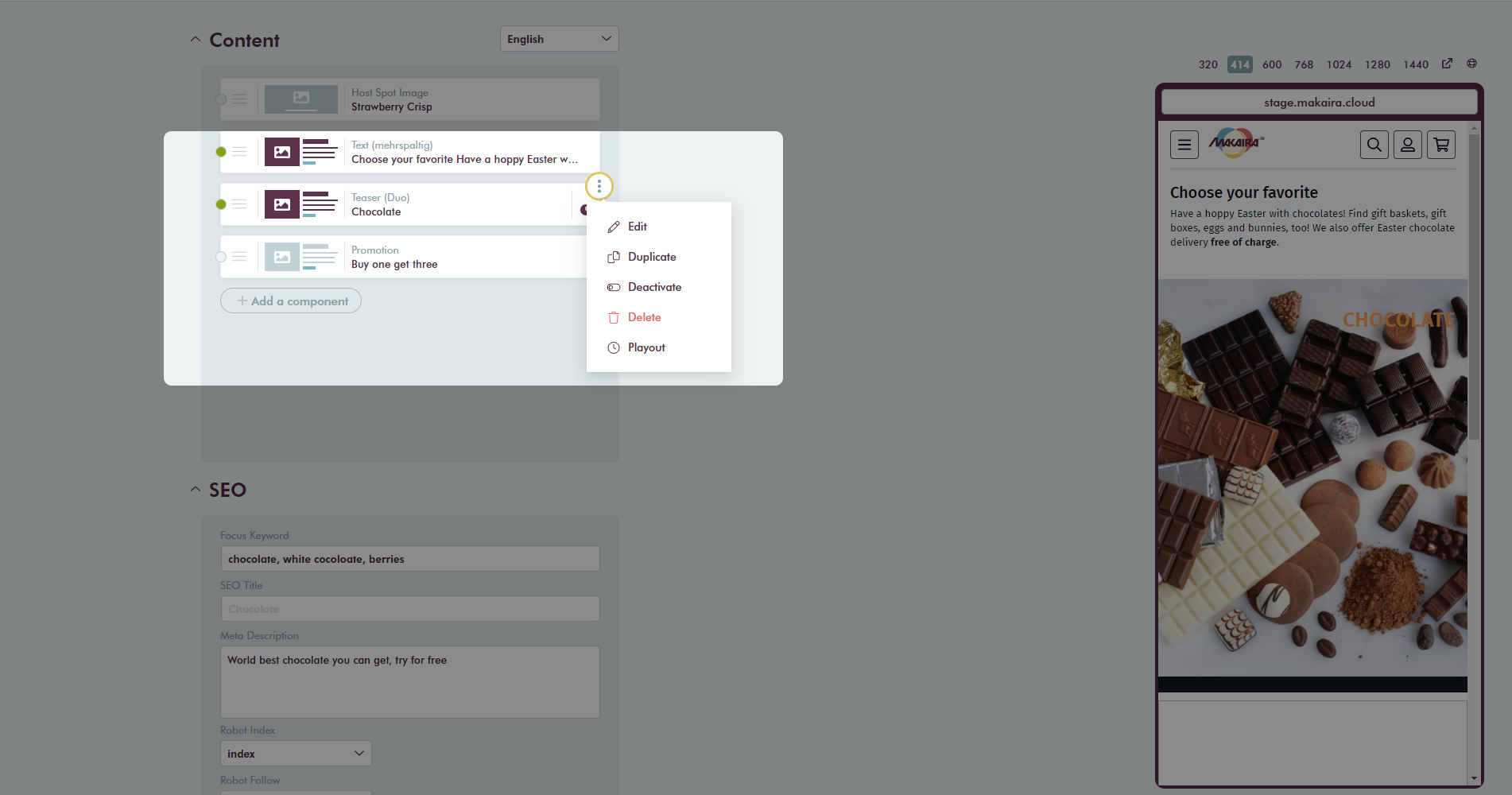
#Time and user controlled playout
The time and user controlled playout can be used to prepare content in advance of TV spots or to restrict content to geographic regions.
Time and user controlled playout
#Live preview
The live preview, placed at the right side of the details editor, gives the content creator the possibility to see how the content page will look after saving the page. Having a live preview gives trust to the editors and avoids broken pages for your customers.
The preview comes with different predefined view ports that can be switched at the top. If you want to have another viewport use the breakout symbol. Be aware that the preview is not what your customer can see before saving the content. If you want to have a look at the current page for the customer use the globe symbol which opens another breakout window with the real live page.
Preview URL
By default, the Preview-URL is your Shop-Domain appended with /preview at the end. But depending on your server settings and your taste this URL can be changed in the storefront code and you can set it to a different path. A valid default URL is for example https://demo.makaira.cloud/preview
Preview for Developers
If you want to use your local machine for seeing the preview (especially helpful when testing newly developed components) you can just hover over the URL field in the Preview and set your localhost e.g. http://localhost:5000/preview as Preview-URL. Please don't forget the preview path at the end of the URL.
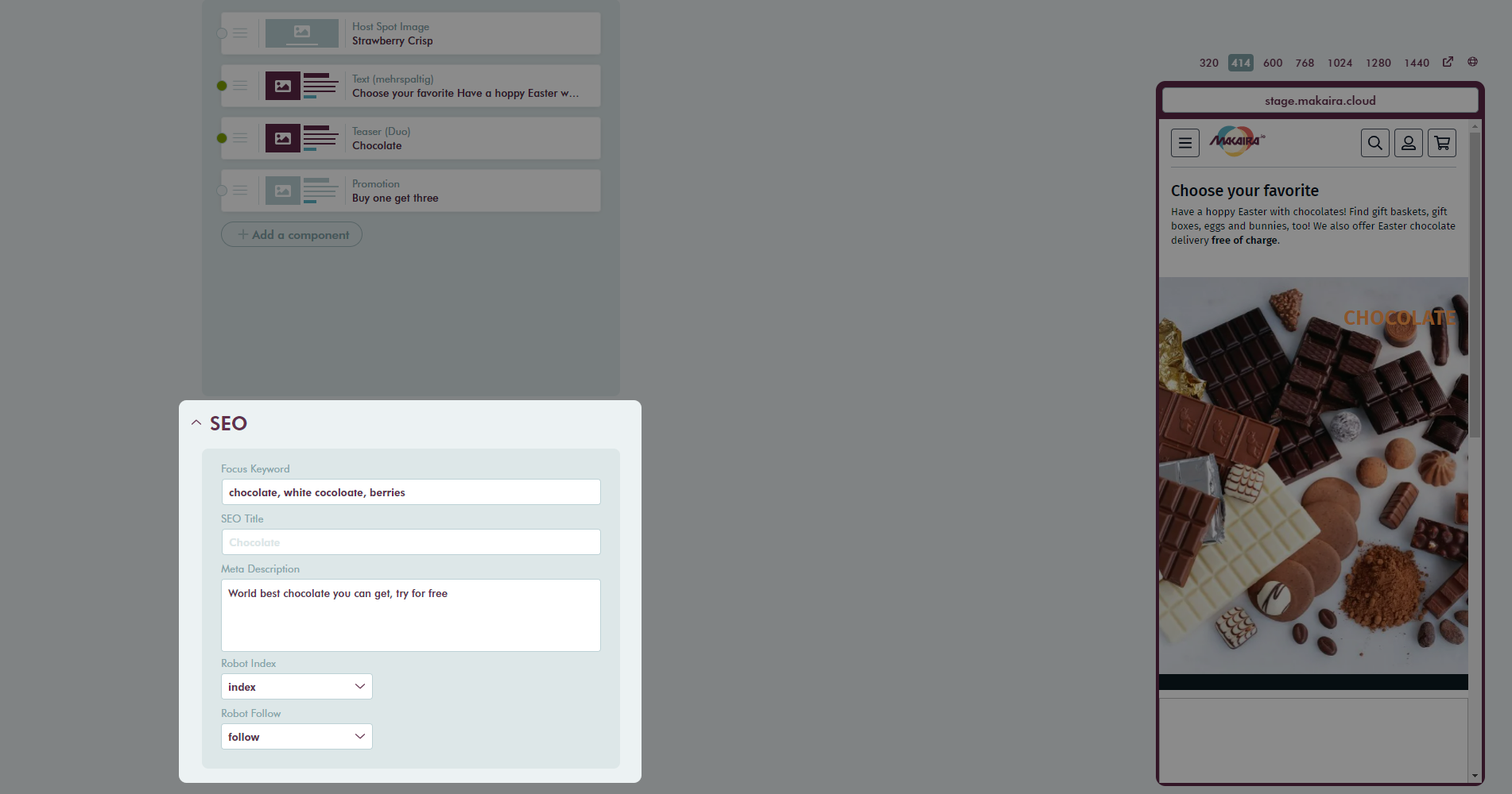
#SEO
With the SEO tab you can add additional values like seo keywords, seo description or overwrite the title from the settings.
SEO details
Further you can set the robot directives for search engines.
| Robot Index | index | page content will be indexed |
| noindex | page content will not be indexed | |
| Robot Follow | follow | links will be followed |
| nofollow | links will not be followed |
#Content orchestration
Components can be easily moved in the list by drag&drop.
Dragging a content element
Over the context menu which appears on hover of components you get shortcuts to make your work as efficient as possible.
#Copy & Paste functionality
After the components are added to the page, the single component or the whole page in the Page Builder can be copied and pasted. The copied elements are stored in a clipboard which allows you to keep up to twenty elements and place them at the desired place at a time.
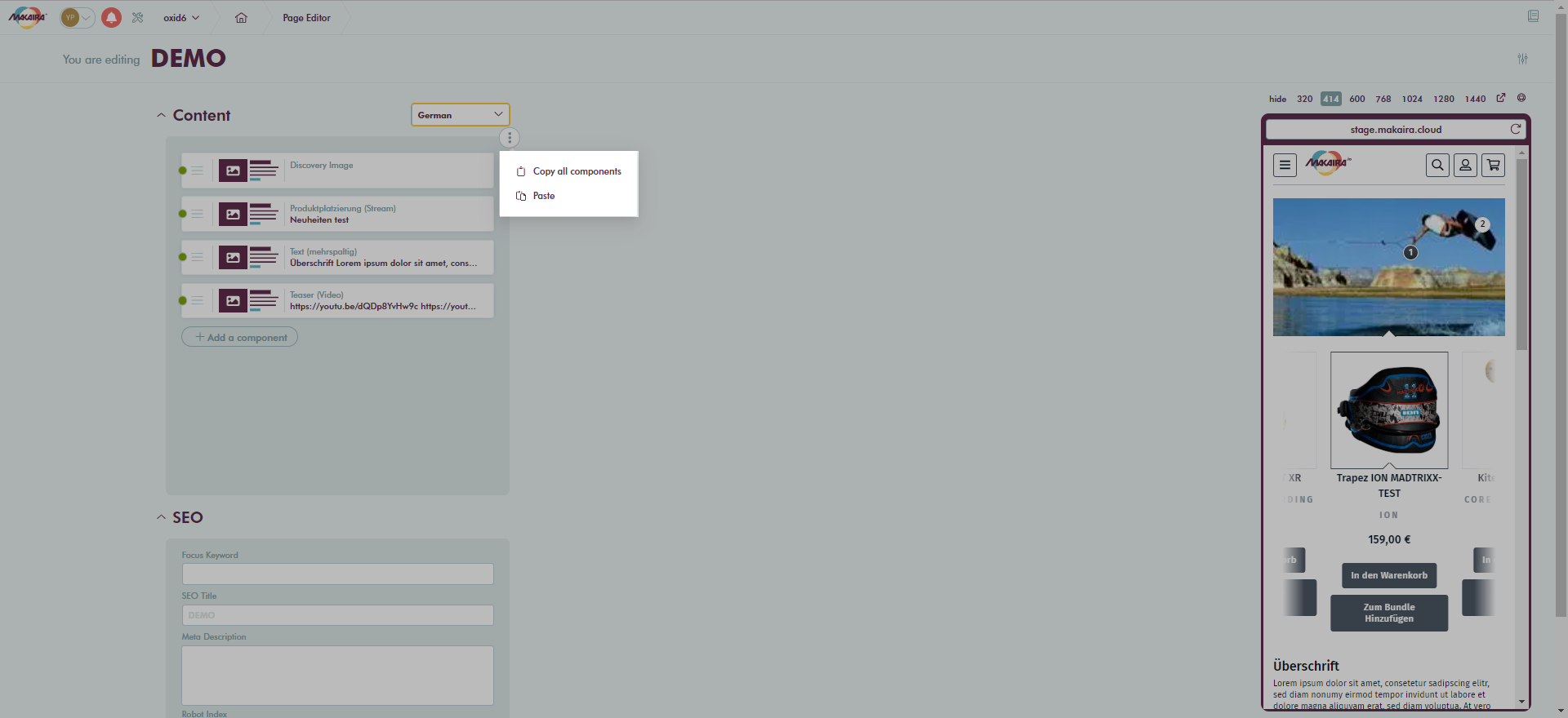
Copy whole page
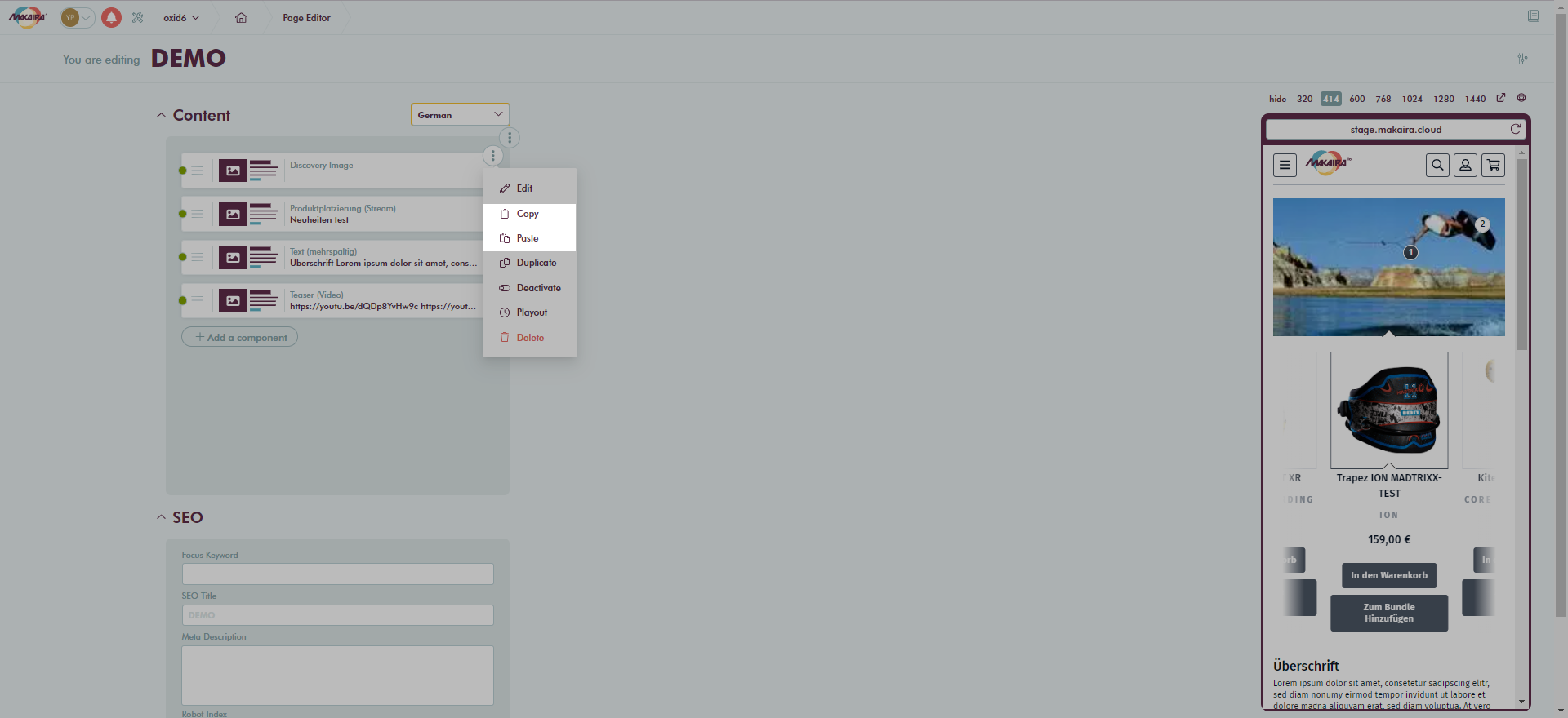
Copy a component
When copying the whole page, the blocks above or below a product grid are taken into account. If the target doesn't contain a grid, the components are inserted continuously.
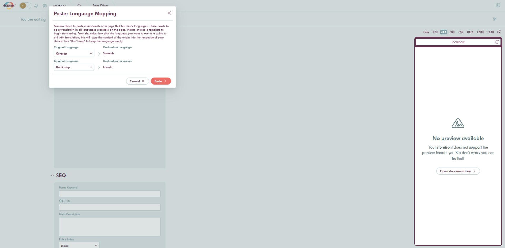
When copying across instances, the languages are assigned dynamically. If a language cannot be assigned on the basis of the language abbreviation, it can be done manually.
Updated 9 months ago